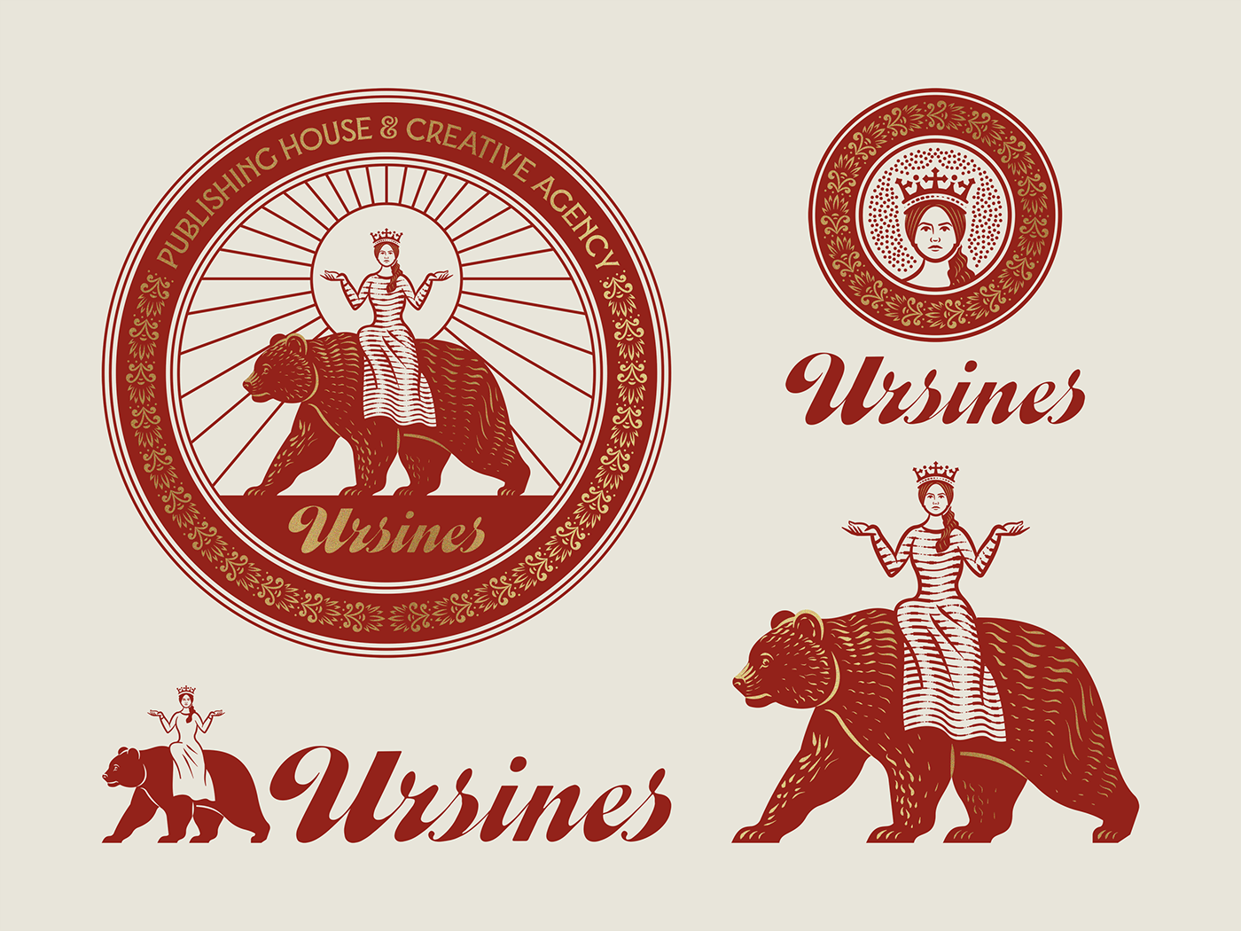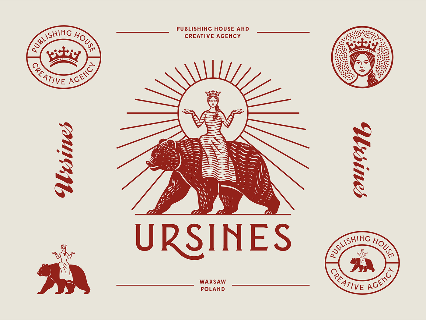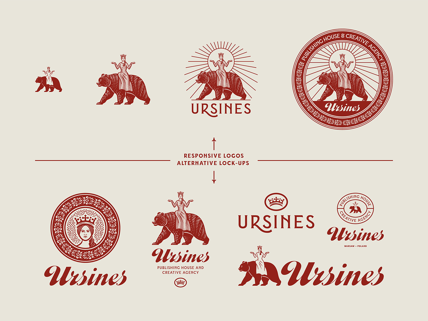
Ursines
Responsive Branding 2020
In this branding project for the polish publishing house Ursines (latin for »Bear«) many things came together that match my vision and inspiration: Detailed engraving-style illustration, responsive branding and heraldic-inspired symbolism.
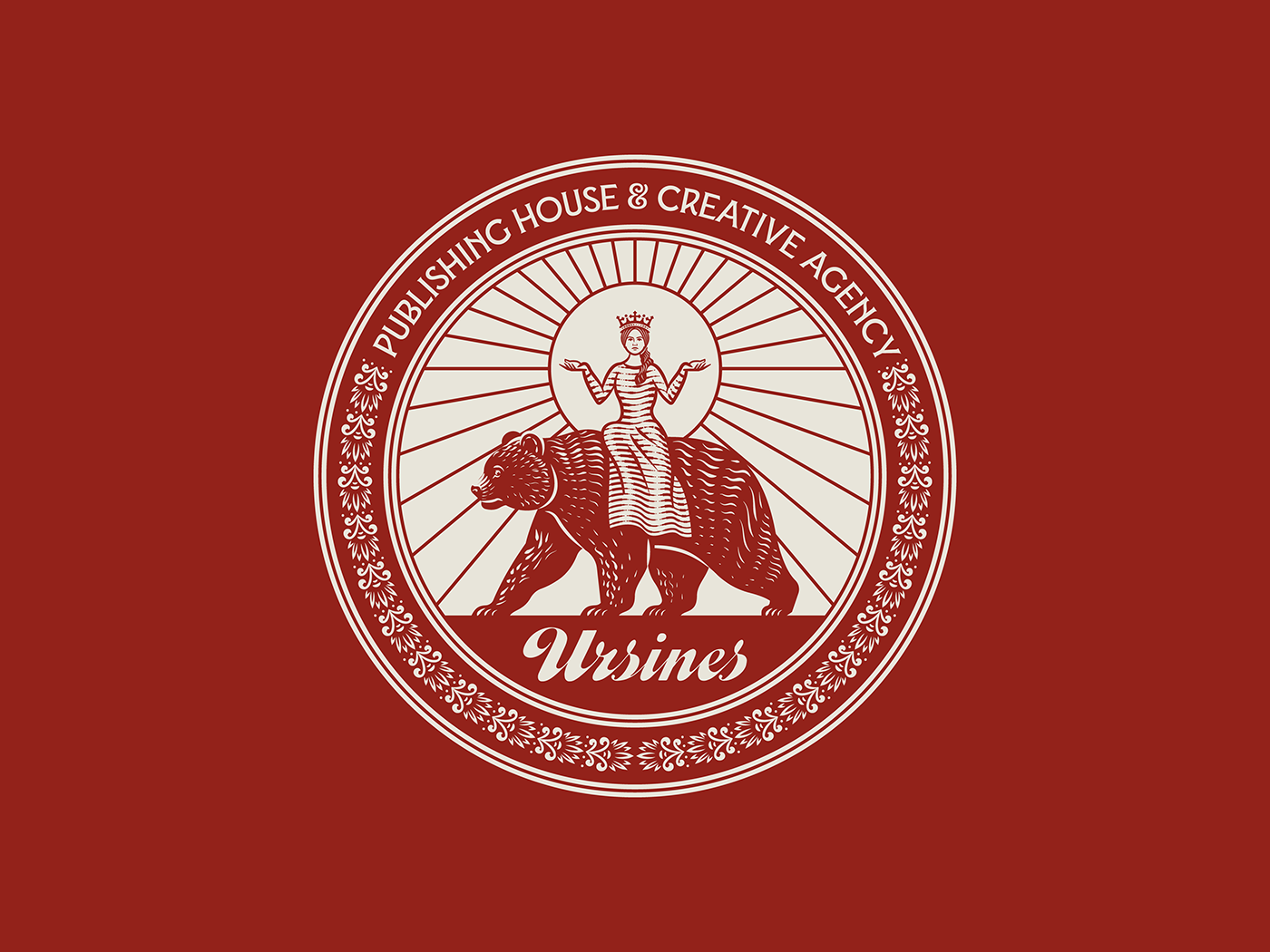
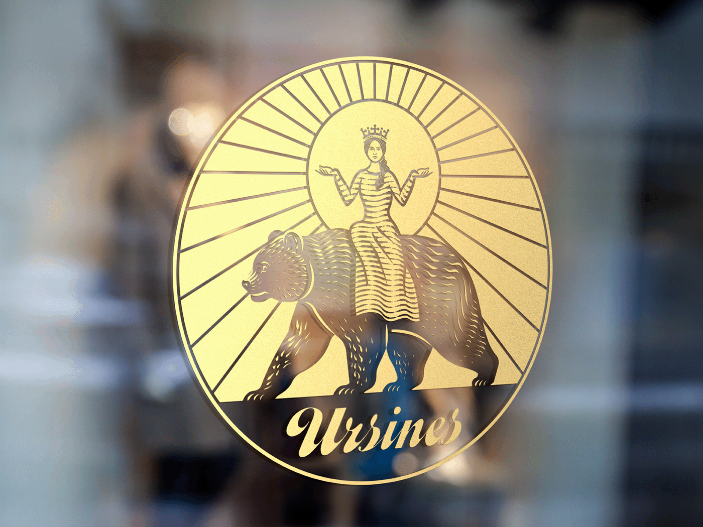
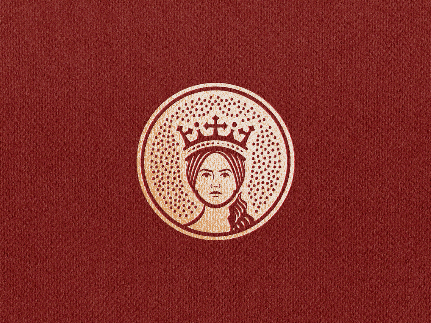
The logo is based on the old noble coat of arms of the Polish town of Rawicz, which shows a princess riding a bear. The symbolism goes back to an old legend in which a king bequeathed all immovable goods to his son and all movable goods to his daughter. However, the king did not want the best for his daughter and wanted a bear to be brought into the daughter's chamber to prove that she could not manage the movable goods. Her death would be inevitable. But she proved the opposite. She tamed the bear and rode out of the chamber on its back. She raised her arms and demanded justice. With this she finally got her rightful part. It symbolizes ability to overcome difficulties with honour, to change confusion into victory.
For the wordmark I used the amazing Callina Script by Brandon Nickerson and for the main branding typeface I used Vance Serif Andrei Robu and Kevin Cantrell. Available from Typeverything!